How did you use media technologies in the construction and research, planning and evaluation stages?
Here is a video of a prezi with audio answering question 4 of the evaluation stage.


 Things that people liked about our magazine cover included the fact that it was quite simplistic, it was not overcrowded yet still contained all of the information which you would expect from a magazine cover. A lot of the audience really liked that we have a few graphic features on our magazine cover, such as the circle full of information and the small square saying "exclusive". They people viewing our magazine cover said they really liked how these graphic features matched up, they contained the same black colour theme with a small white line around then edge. These also go well with the titles, as they are also made up of lines. They did say that we should possibly move around some of the graphic features to make them fill up different parts of the page.
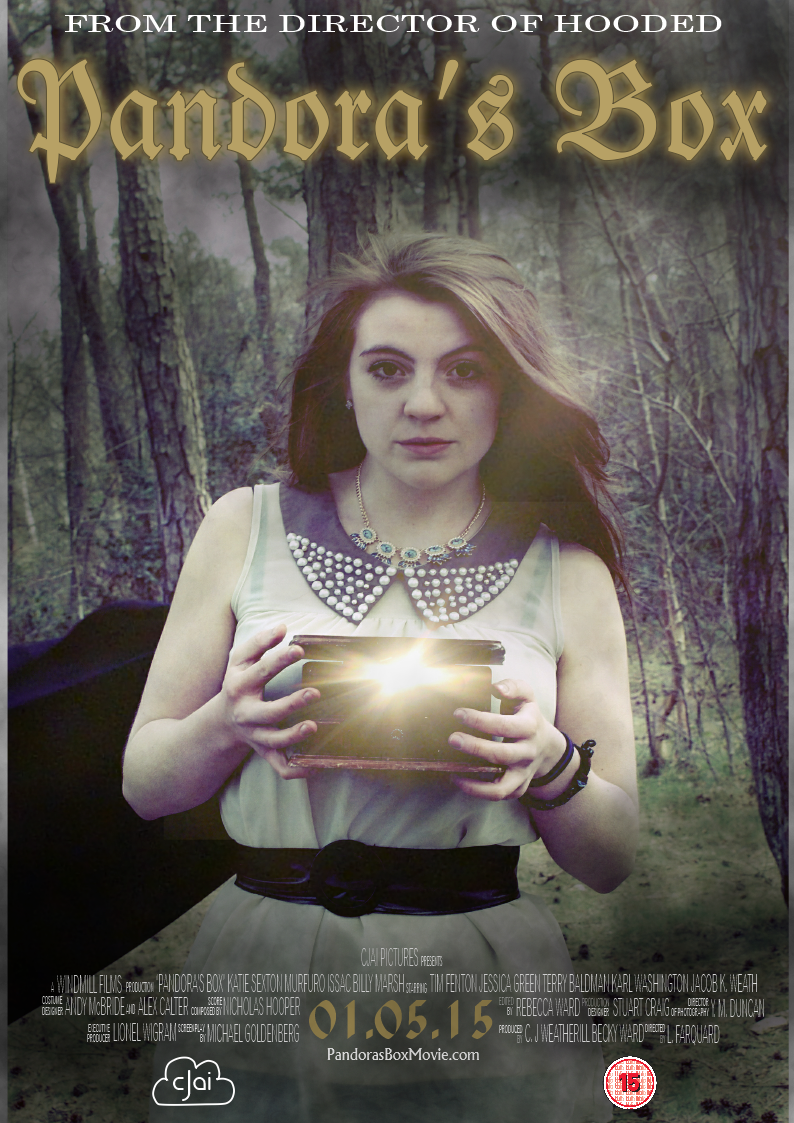
  People really liked the image we chose for our poster. We were told that it made the genre of the film apparent and therefore there would be no confusion over the genre of the film. The image was also apparently very eye catching and would catch the attention of the audience against other images. The next thing people really liked was our use of image editing and the light coming out of the box which gave a mystical appearance which added to the idea of genre. The font was also pointed out as suiting the genre.
 This magazine cover is from the magazine 'Total Film' this is a well known film magazine. The first thing I notice about this magazine cover is the Master Head, this is the name of the magazine. The 'Total' part of the title is placed in purple, slightly smaller and positioned in the top of of the F of the word 'Film'. The word 'Film' is then placed in white bold across the top half of the magazine cover and takes up about a quarter of the page. This makes it extremely eye catching and makes it standout more against everything else on the cover. The magazine is already popular and well known and people already know the name, which allows the designer to place part of the photograph over the title. The white colour stands out against the dark-ish purple background. This makes it extremely eye catching. If people are regular readers of the magazine the masterhead will be a selling point for the magazine. The white is also a neutral colour, as this is a magazine aimed at both men and women instead of one gender.
 In order to get a name for our magazine which was popular with our target audience, I created a survey on surveymonkey to see which of all of the ideas we had had for out magazine title was the most popular. The first question on this survey was asking what the gender of the person taking the survey was. From the 5 people which we had answer the survey, two were male and three were female. This is fairly equal which shows that the results we have gathered are true of both a male and female gender.
  The next question is asking what the age of the participant of the survey. We had people ranged from 12 to 21 answer our survey, however the majority of the people answering the survey were ages 15-17. As our target audience is older teenagers, this means that we have our niche audience answering the survey and therefore the results will be more relevant. One thing we could have improved when creating our survey is people selecting their specific ages instead of an age bracket.
 The final question is one about which magazine name they find the most appealing. Overall the most popular magazine title, with 3 out of 5 votes, is the title 'Outtake'.
  The next poster I have chosen to analyse is one taken from the advisement for the movie 'Snow White and the Huntsman'. The first poster here is the main one used for advisement for this movie. The first thing which stands out is the title. It is placed on the bottom part of the image but in a large font to make it stand out and catch the audiences attention. It has been placed in a silver metallic looking font which fits into the theme of the poster with the silver and grey being main features in the colorisation of the images. As it is placed in large text it means it stands out and catches the audiences attention. It has also been placed so it doesn't overlap with the character's heads in the image, this is because they are also a focal point and if they were to overlap it could detract from one or the other. The title is possibly one of the most important things about a film poster as it tells the audience the name of the film and if they find the poster appealing they will hopefully remember the name and then want to watch the fill movie.
  As well as this standard poster. The designers made a set of individual character posters. I have selected two of these, both of the character of Snow White to take a look at. The title of the film is still placed in a very clear place on the poster. One in the centre at the bottom, much like the standard poster, and the other it is placed on the left hand side.
  The final poster I will be looking at for the advertising campaign for 'Snow White and the Huntsman' is a close up character poster. This shows a close up of Snow White in the same costume and pose as the full length character poster only with some slight differences.
 The names of all of the main actors and actresses, who also appear on the poster, are placed in the same gold coloured text at the top of the page, however in a slightly different font to the title. The names are also placed in capitalized letters which makes them stand out slightly more. Typically when a person looks at an image their eyes well start at the center of the image and then look up and down, by placing the names at the top they are subsequently the second thing the audience sees after the name of the film, this has also been done because when film posters are exhibited, the names are just above eye level of the average adult which makes them more eye catching. Although the names are large they do not detract from the overall image as they, much like the title, do not overlap with any of the images of the actors. This is something we will have to take into deep consideration when creating out own film poster.
 The genre of the film is similar to the genre of our film, a fantasy film which contains elements which are darker and scarier. However, this specific film will contain less of the dark element of the genre because it is a family audience targeted film. The images therefore reflect the genre. Our own movie will be a 12 and therefore it will be allowed to be slightly more scary instead of a dimmed down version of horror.
 As well as the standard A4 portrait poster, a landscape one was created for perhaps buses or landscape billboards. It contains all of the same elements as the first, it just lacks the institutional information and the text is placed towards the left and the image to the right as there is no overlap.


