Thursday 16 April 2015
Wednesday 15 April 2015
Poster Edit
We editing our poster onto a bus stop, as this would be where our poster would be advertised. We have done this because our niche target audience is teenagers, and this group of people mostly use public transport for travel.

This is our poster that has been edited on to a poster board at a train station, this is a a conventional place for film posters to be advertised as there is always members of the public waiting for trains and when people don't have anything to do, the poster will attract their attention which means they would have knowledge that the film is being shown in cinemas soon.

Lastly I have edited our film poster on to a billboard that is located on the side of the road. This allows drivers who are driving past to view the poster and make them aware of the film.It would be placed on one of the busiest roads as this would allow a larger audience to view the poster, furthermore on busier roads means that there could be more traffic jams, so if there is one then the people stuck in the traffic jam would almost be faced to look at it.

Tuesday 14 April 2015
Final Magazine Cover
After all of the constructive criticisms and self improvements, we created our new magazine cover. Here is the finished product:

Final Poster
After receiving our feedback we finalized our poster adding some of the elements which our target audience though would improve it to create our final poster:
Monday 13 April 2015
Stereotypes of characters
The protagonist character of our film is a white, teenage, female. Normally the protagonist is a young adult, white, male. This is challenging the stereotype of a protagonist character. Normally female characters fill the character roles of a heroine or romantic interest. Female characters, especially young ones, are often associated with being innocent, vulnerable and naive to situations. They are normally the ones who get into danger and are incapable of saving themselves. Our character however, has a side to her which is incredibly strong both physically and mentally. This ensures that she is able to save herself from situations which occur instead of relying on the help of others. Although strong willed, she does have a vulnerable and weak side which is presented during parts of the trailer and I have written into the actual storyline that she is saved not once but twice by a male character. Originally I did this without thinking about it, it is written into my brain the idea of males being the ones that always end up saving the day, because it is such a strong stereotype of the character type. The fact that her character is mostly independent and has the power such as to fight and kill someone, makes her a good challenging character for fantasy film stereotypes. As the audience for my film will be mostly females, having a female protagonist attracts this audience in.
Another stereotype is that white characters are normally the "good guys" within the film, although the protagonist fits this stereotype, the 'side kick' character is black and therefore challenges these stereotypes. He is also male, this also fits the stereotypes as normally in fantasy films the side kick character is male. An example of this is Sam in Lord of the Rings who is Frodo's (the protagonist) side kick. Sometimes, however, the side kick is female if they are placed there for a romantic interest purpose. Ours is in reverse with the side kick as a male and the protagonist as a female and there being a romantic interest between the two.
Another stereotype is that white characters are normally the "good guys" within the film, although the protagonist fits this stereotype, the 'side kick' character is black and therefore challenges these stereotypes. He is also male, this also fits the stereotypes as normally in fantasy films the side kick character is male. An example of this is Sam in Lord of the Rings who is Frodo's (the protagonist) side kick. Sometimes, however, the side kick is female if they are placed there for a romantic interest purpose. Ours is in reverse with the side kick as a male and the protagonist as a female and there being a romantic interest between the two.
Saturday 11 April 2015
cJai logo

To make our poster appear more realistic I decided to make a small logo for one of our production companies to place under the institutional information. I created this logo on SerifDraw. It is made of text and then I drew the shape of a cloud surrounding it. It has been placed in white so that it looks in place when placed next to the white institutional information.
Friday 10 April 2015
Magazine Cover - Draft 1 FEEDBACK
We presented our findings to a group of teenage people ranged from 17 to 19. The people in this sample group were all female as we wish to aim our product at this demographic. Below is the notes we took when people were analysis our work for what they liked about it and what they felt needed improvement.
 Things that people liked about our magazine cover included the fact that it was quite simplistic, it was not overcrowded yet still contained all of the information which you would expect from a magazine cover. A lot of the audience really liked that we have a few graphic features on our magazine cover, such as the circle full of information and the small square saying "exclusive". They people viewing our magazine cover said they really liked how these graphic features matched up, they contained the same black colour theme with a small white line around then edge. These also go well with the titles, as they are also made up of lines. They did say that we should possibly move around some of the graphic features to make them fill up different parts of the page.
 Things that people liked about our magazine cover included the fact that it was quite simplistic, it was not overcrowded yet still contained all of the information which you would expect from a magazine cover. A lot of the audience really liked that we have a few graphic features on our magazine cover, such as the circle full of information and the small square saying "exclusive". They people viewing our magazine cover said they really liked how these graphic features matched up, they contained the same black colour theme with a small white line around then edge. These also go well with the titles, as they are also made up of lines. They did say that we should possibly move around some of the graphic features to make them fill up different parts of the page.
The people viewing our magazine cover also liked the way the text and image overlapped, although they believed that we needed to move the title up as because of the layers within the image of pandora and the tree she is hiding behind, it looks a bit off as the title lays behind the character head and not the tree. By just moving the title up a little bit it won't look so off.
Something else that the audience said we could improve was some of the text, apparently it was hard to read from the distance they were looking at it and so we my stretch the text out a bit so that it is easier to read.
Other than this, people said our magazine cover was very good and that they especially likes the editing we had added to the photograph which made the image very apparent of the genre as we editing in things like myst and shadows which are conventions of the genre.
Poster - Draft 1 FEEDBACK
We presented our findings to a group of teenage people ranged from 17 to 19. The people in this sample group were all female as we wish to aim our product at this demographic. Below is the notes we took when people were analysis our work for what they liked about it and what they felt needed improvement.
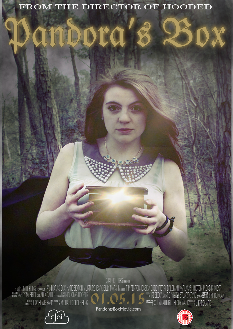
 People really liked the image we chose for our poster. We were told that it made the genre of the film apparent and therefore there would be no confusion over the genre of the film. The image was also apparently very eye catching and would catch the attention of the audience against other images. The next thing people really liked was our use of image editing and the light coming out of the box which gave a mystical appearance which added to the idea of genre. The font was also pointed out as suiting the genre.
We received some pointers on how to improve our product. These included maybe changing some of the colours of the text to add more variation and make the text less boring and more eye catching. We were also advised to add actor names or logo's for the production companies to make the poster look more realistic and also to add more information to make it more interesting.
Our audience also suggested that we could possibly add a glowing effect to the title to add to the idea of the genre of fantasy and it gives the writing a mystical effect.
People really liked the image we chose for our poster. We were told that it made the genre of the film apparent and therefore there would be no confusion over the genre of the film. The image was also apparently very eye catching and would catch the attention of the audience against other images. The next thing people really liked was our use of image editing and the light coming out of the box which gave a mystical appearance which added to the idea of genre. The font was also pointed out as suiting the genre.We received some pointers on how to improve our product. These included maybe changing some of the colours of the text to add more variation and make the text less boring and more eye catching. We were also advised to add actor names or logo's for the production companies to make the poster look more realistic and also to add more information to make it more interesting.
Our audience also suggested that we could possibly add a glowing effect to the title to add to the idea of the genre of fantasy and it gives the writing a mystical effect.
Thursday 9 April 2015

Wednesday 8 April 2015

Tuesday 7 April 2015
Empire, The Hobbit Edition - Magazine Cover Analysis

The master head takes up a quarter of the page, this immediately makes it stand out and draws the audience in. Another element of the master head which could draw the audience in is the that the master head is in a shiny gold colour, which reflects and easily catches the audience attention. The gold text also fits in with the idea of the poster being a promotion of the Hobbit movie, the ring which is featured in the movie is gold and therefore the text may be a reflection of this. This helps tie image and text together, instead of them appearing segregated on the page. Even though the master head is slightly obscured by the feature character, we can still easily distinguish the brand as it is a very well known and publicised film magazine. The typography that is featured around the mast head are play on words, and jokes which are associated with Lord of the Rings and any fan would recognise. Examples of these are words such as "Precious" which is one of the most well known words associated with the film. Another example could include "shires biggest movie magazine" as the Shire is a setting within the movies. I believe that the magazine has done this to make it stand out from any other magazine doing coverage of this film, it also attracts and very specific audience of those who are fans of the Lord of the Ring films. The text above the master head, as well as containing a Lord of the Rings reference contains with word "exclusive" which is a buzzword. This makes the audience believe that there is something unique about the coverage of this film within this specific magazine, thus making it stand out from the competition.
Despite the fact that this magazine features only The Hobbit, image wise, on the front cover there is other typography displayed to the left which tells us that it features other insides in to films such as "Dredd" and "Taken 2". These are placed in a bold font which makes them standout, however, they are not placed large enough for it to detract from the overall magazine cover. The promotion of other films and other articles is very important for a magazine, although there is a main feature, there needs to be other films promoted. This is something I will take into account when creating my own magazine cover. This section is often title something like "Plus" or "Also inside". This reveals hardly any information about the other articles which are inside, making it a requirement to buy the magazine so that they can read the articles and find out what is written on these pages.
Above the master head, and the 'M' of 'Empire' is the price and website, this information is placed in a small font to make sure it does not distract from the overall magazine cover but is placed somewhere where it can be easily viewed. The use of a website being featured on the magazine cover tells the audience that there is also more content available online. Which also contributes to the fact that more people are interested in online articles. This is something we will have to take into account when creating our own magazine cover.
Apart from the image and the mast head, the other thing which really stood out is a gold badge which reads: "The Dark Knight Rises: The Verdict". This is promotion for yet another film. By placing it in this circle shaped, gold and therefore stands out and highlights this information for the audience to read.
The final piece of text is on the bottom which contains the name of the film being promoted and "The finest middle earth coverage continues inside". The latter reached out to a fandom, again anyone who likes Lord of the Rings will definitely want to read this magazine using genre specific language to have a positive effect. For example, the word 'Finest' so obviously, people will want to read the best quality stuff around and therefore pick this one if they are not interest in the Hobbit film.
The image contains the main characters and another vital character within the film. It sets out conflict already for the film as we can clearly see that there is a good guy and a bad guy which is summing up the film up as a whole just using one image. We can tell that Bilbo is going to be a hero in the film as he is presented as the big feature, he is standing in the like holding a sword which suggests he is the hero as he looking like he is going to fight away evil. Swords also connote the idea of knights in shining armour which are a convention of heroes. He plays a positive role in the film as he is defending himself and the rest of the Lord of the Rings community. The next thing that the audience noticed in the image is Golum lurking in the shadows, in the cave. He is half in shadow and half in light, showing that he has the mixed personality that he does, the light side represents his "good side" and the shadow his "evil side".
In terms of mise en scene and costume, Bilbo's red jacket connotes to the audience to the danger that he is having to face by going in to the carve there Gollum is discovered. The white scarf tired around his neck shows a sense of innocent as Bilbo came from a small cottage in the Shire, living in what was like a bubble of innocence.
The background of this photograph is a stage scene, which is most likely a lot of photoshop, it is a cave which suggests that parts of the movie will subsequently set in caves. By seeing this image, we are instantly able to sum up the movie as a whole as it is set out for us.
Total Film, Alice in Wonderland Edition - Magazine Cover Analysis
 This magazine cover is from the magazine 'Total Film' this is a well known film magazine. The first thing I notice about this magazine cover is the Master Head, this is the name of the magazine. The 'Total' part of the title is placed in purple, slightly smaller and positioned in the top of of the F of the word 'Film'. The word 'Film' is then placed in white bold across the top half of the magazine cover and takes up about a quarter of the page. This makes it extremely eye catching and makes it standout more against everything else on the cover. The magazine is already popular and well known and people already know the name, which allows the designer to place part of the photograph over the title. The white colour stands out against the dark-ish purple background. This makes it extremely eye catching. If people are regular readers of the magazine the masterhead will be a selling point for the magazine. The white is also a neutral colour, as this is a magazine aimed at both men and women instead of one gender.
Above the masterhead is another piece of text saying "Free Giant Iron Man Poster!". This is also placed in bold, but in a yellowy gold text and is far smaller than the masterhead. The title contains the word "Free" - this is a buzzword which draws the audiences attention as they believe that by purchasing this magazine they are getting something free. Giving out free things is something which is commonly used within magazines in general, free posters/ discounted cinema tickets or cinema food vouchers are often included in film magazines as they give the audience more motivation to buy the magazine as they feel as if they are gaining something other than a magazine.
Along the left side of the magazine is a lot more text, at the top of this section is black bold text in a gold square which says the words "WORLD EXCLUSIVE!" this again contains the buzzword "exclusive". This suggests to the audience that this magazine has information about the film which no other magazine would have. The fact that it is also a worldwide exclusive, makes it seem like by purchasing this magazine and readings its contents you are finding out something which is otherwise unknown and that you have extra information and knowledge that other people do not have. This makes it obvious that to make a successful magazine cover I will need to include a variety of buzz words to make it stand out for the audience and make it individual from competition magazines.
The next piece of the text placed here says "Welcome to Wonderland! Johnny Depp heads up out" and then placed in a much larger text of the same font and white colour, but placed in capitals "MASSIVE 2010 PREVIEW". The word massive is exaggerated even more by the fact that the text is literally massive. Another element which makes this bit of text stand out is the use of the actors name "Johnny Depp". Johnny Depp is a very well known Hollywood actor, he himself has a very large following and therefore when he is leading something like a preview means that his fans will want to view this preview. People who have watched and enjoyed any of Johnny Depp's previous movies will therefore want to watch his new one.
Johnny Depp is also the main image on the magazine cover. Dressed as his character 'The Mad Hatter' from his latest film 'Alice in Wonderland'. This gives the viewer an insight into what the film is like. The fact that the image is separated from its background allows the text to overlap and integrate the image. This creates more of an aesthetically pleasing cover for the viewer. The image consists of a mid front facing shot of the character, looking directly at the camera. The direct eye contact of the actor and the audience looking at the image creates a relationship between the character and the audience, making them interested in the character and therefore want to watch this film. The use of a mid shot makes sure we see enough of his costume to understand part of his character but not a long enough shot to make the character appear distant.
The mise en scene, of the costume is exactly that of his character within the film. His jacket is purple and so goes with the background of the magazine cover. This helps the image to look as if it is part of the magazine but doesn't make it completely blend in. The image has had its vibrancy increased, for example, the orange hair is very vibrant to make it stand out against the background and therefore make the image stand out more.
At the bottom of the magazine cover is another advertisment for something which is inside the magazine, it states "Plus Daniel Day-Lewis / Mel Gibson / Blu-Ray Special". This is in bold text and fairly large, this makes it stand out on the poster without detracting from the image.
Above the 'M' in the word 'Film' is information such as the date the magazine was released, the price and issue number. In this example it also contains the magazine's website. This information is placed in a viewable place but not in a large text so that it could detract from the image.
The last noticeable thing on this magazine cover, is the use of a barcode being positioned on the front of the cover. Barcodes are almost always placed on the front of the cover because normally on the back of any type of magazine there is an advertisement. When creating our magazine cover we will make sure we place the barcode on the front cover, although it can often appear as if it is ruining the cover, if it is placed in a less noticeable place, such as on the bottom of the page or on the side it detracts less from the image.
Sunday 5 April 2015
Poster - Institutional Information
Based on what I have done while researching posters, it has been made clear that on the bottom part of my poster I need to have written some institutional information in a small font which tells the audience information about who is in the film and some of the people involved in the different stages of production, such as director, editor, costume designer and of course actors and actresses.

Here is the institutional information I was able to create using the editing software 'Serif Draw'. It contains all the names and jobs of the people involved in all stages of production. In the center is also the date of release which is a larger font which makes it stand out and the website for the movie. This is a typical lay out which is a convention of most movie posters. I will placed this on the bottom of the poster which is typically where it is placed.
Subscribe to:
Posts (Atom)